A15.2 Exercises - LUPMISManual
Main menu:
A15.2 Exercises
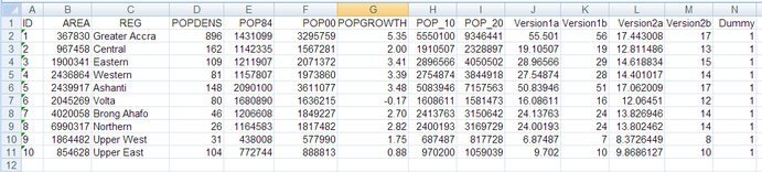
Following example is based on official census figures, released by a UN support project, as displayed in the Excel spreadsheet below (column A-F). Column G shows the calculated growth rate per region (steps 1.1-1.4 below), column H the projected population 2010 based on linear regression of the past 16 years (steps 1.6-1.8), column I for 2020 respectively.
1. Calculation of growth rate in Excel:
1.1 Calculate the growth rate, using the Excel formula:
= ((F2/E2) ^ (1/16) -1 ) *100
or: = ((POWER(F2/E2), 1/16 ) -1 ) *100
(which is the same as the formula above, but without the ^, in case you don’t find it at your keyboard)
(where F2 and E2 are cell references for population figures of different years, 16 is the number of years in this example)
Adjust accordingly!
1.2 Round this result to 2 decimals, using the Excel formula:
= ROUND(G2 , 2)
Adjust accordingly!
1.3 Check that the result is a number with 2 decimals
Select > right-mouse > Format cells >> Numbers > 2 decimals
1.4 Convert these ‘Excel formulas’ into fixed values:
Select > right-mouse > Copy > new cell > right-mouse > Paste Special > Values
You now have the growth rate figures in Excel (column G in the example below). Be aware, as expressed in Annex 15.1 above, that the planner has to modify these growth rates according to actions of the Framework and Structure Plan.
Once the ‘new’ growth rate has been established, continue with the population forecast:
2. Calculation of future population in Excel:
=F2 * ((1 + G2 / 100) ^ 10)
or: =F2 * POWER((1 + G2 / 100) , 10)
(which is the same as the formula above, but without the ^, in case you don’t find it at your keyboard)
(where F2 and G2 are cell references for population figure and growth rate, 10 is the number of years in this example)
Adjust accordingly!
2.1 Round this result to integer, using the Excel formula:
= ROUND(H2 , 0)
Adjust accordingly!
2.2 Check that the result is a number with 0 decimals
Select > right-mouse > Format cells >> Numbers > 0 decimals
2.3 Convert these ‘Excel formulas’ into fixed values:
Select > right-mouse > Copy > new cell > right-mouse > Paste Special > Values
You now have the future, planned population figures in Excel (columns H and I in the example below for 2010 and 2020 respectively).
- - - - -
3. Visualization in Map Maker:
You should not take these figures directly into Map Maker, as they might be too large and differences might not show easily.
Through simple arithmetics you can bring these figures (for examples, columns H and I) to a ‘manageable’ size – easier for visualization.
Following calculations are allowed:
Multiplication
Division
Following calculations are possible, but should be applied only in exceptional cases, because they might give a wrong impression:
Log
Square root
Power of
Do not use, as they might distort the data:
Addition
Subtraction
Create a dummy column N with 1 in each row for easy import to Map Maker (see example table above, at the very right).
This spreadsheet is now ready for import into Map Maker. See Chapter 4.3.6 or 4.3.7 for the procedure. Under ‘data chart’ selection, use the dummy column, as shown below.
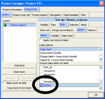
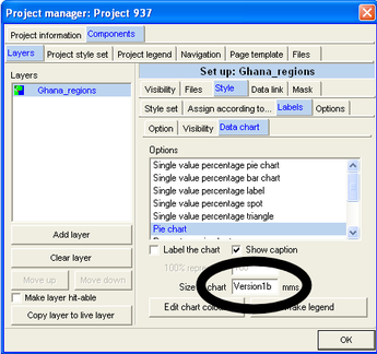
In the next window, select the top row of the column with the data, which you like to display (here 'Version1b').
For example:
2.1 Reduce the figures to smaller numbers, into column J
= H2 / 100000
2.2 Repeat step 1.6
2.2 Repeat step 1.7
2.4 Repeat step 1.8
Results are now in column K.
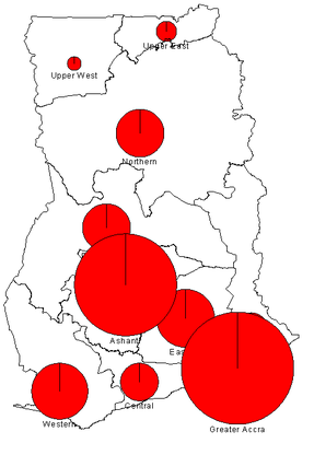
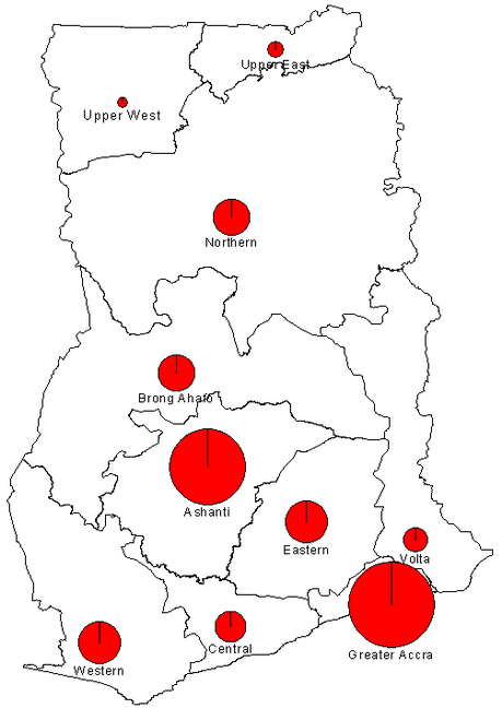
This map of the projected population Ghana 2010 is not the very best presentation of these data. As an exercise, reduce the figures for improvement.
2.5 Divide all figures in column J by 2 to come up with smaller circles.
2.6 Repeat step 1.6
2.7 Repeat step 1.7
2.8 Repeat step 1.8
Again, import these data into Map Maker and display the map:
With the log or square root function you can also reduce the differences (7-56 in column K) to a better range (8-17 in column M). Work on column L:
= LOG(J2) , or
= SQRT(J2)
and repeat steps 1.6-1.8 as above.
There are many more options to improve both on the arithmetic side in Excel and on the presentation side in Map Maker. For example, use also the ‘Histogram’ and the ‘Single value percentage pie chart’ options.